Monday, 11 May 2015

Miss Havisham Hair Chart Initial Ideas

 Design 1

For my first design i gained inspiration from The Miss Havisham portrayal by Gillian Anderson in the 2011 TV series adaptation. This look will be based on the early victorian style; Tight ringlets by the sides of the face, and the rest of the hair tight back and twisted into a knot. The Bun will then be decorated by tying a ribbon around the Bun. The hair will be changed to grey by applying Dry shampoo and powder onto the surface of the hair. I really like this design, i think that there is interesting quality to its simple yet pretty design. However, compared to the makeup design, its fairly neat and tidy, so i don't know if it will match up to the same dramatic effect in comparison. 
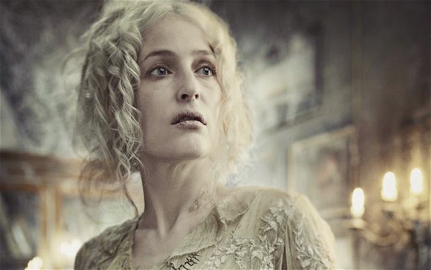
http://i.telegraph.co.uk/multimedia/archive/02123/misshaversham2_2123727b.jpg

Design 2

This Hairstyle is supposed to portray the bedraggled, unkempt appearance of Miss Havisham. It was once a beautiful wedding up-do, with the back portion of the hair tight back into a beautiful Chignon, and the hair down the sides of the hair were once beautiful Riglets. I will also apply the aging technique to the hair as well, using dry shampoo and powder. This Style represents my charcater well, although, i feel that there is too much hair left down at the back, and it is slightly on the dull/ boring looking side. The style needs to have a bit more of a wow-factor, so that it can compare and compliment my makeup design idea niely. I also feel that as there is alot of hair down, that needs to be waved it wont be a simple design to recreate for my second application.

Design 3

My third design is quite possibly my favourite, by far. The style is simple, yet very much complimentary to my makeup. The style involves the sides of the hair being in loose curls; which were once tight ringlets. THe rest of the hair is tied back into a messy bun, which was once a glamorous Chignon. The hair is loose all over with a large amount of stray hairs flying about. The hair is also decorated with a veil, (which i hard to see in the image), which is fasten with a comb. I really like this idea, and am set on using this design for my Charcater portrayal. I personally, cannot see any fault in the design itself, the only issue i hold, is toward the continuity. I feel that it will be a hard design to get the continuity perfect with, regarding the loose hair and getting it to match up to my first application. 

Continuity importance

Continuity within TV and Film is incredibly important; the reason for this is that it helps to keep the flow of the production, what is more distracting when you spot an incontinuity when watching a film?! incontinuity can occur within a number of aspects within the developement of the film/ Show. It can arise within the Acting, props, costume, Hair and makeup styling and the '180 line', just to name a few. 


Miss Havisham Practice


 Before fully deciding on a final design, i wanted to test soem of my options and different techniques i could use instead of/ or incorporated into my final design. I first practiced what the grey tinged base foundation would look like if applied to the skin; as i know that grey sometimes appears with a slight bue-ish tinge to it. However, i feel that this base doesn't have a blue tinge to it, i feel that it is slightly too dark and doesnt particularly look natural. So for future reference i will know not to add as much black into the mixture, and maybe slightly more white instead. I practiced the theatrical aging as well, which i am definately set on using for my design, but all i need to do in regards to that is practice, practice, practice! and become fully confident with the application.

I know that using the theatrical aging, however, will be hard to recreate exactly the same, so i thought if i applied a thin layer of duo glue to the skin, then dabbed at it while  it was drying, it would create a withered almost decaying look that would work really well with the Miss Havisham design. The Problem with this, even though i liked the result ALOT! was that it would be impossible to recreate it for my second application. the 'holes' will not be in the same places and it just wont work for continuity.


I also Practiced the Tear lines using Latex, i created them by letting latex drip down on a flat surface and dry slowly. Then cutting them to shape, I painted them with black supra colour and powdered them. When i applied them to the face i found that they were just too big and outrageous, they actually looked slightly ridiculous! so that idea has completely gone out the window! It might be a different story if i used eyeliner drips, but like the latex decaying idea, it just would be impossible to recreate.


Miss Havisham Face Chart Initial Ideas

Design 1


For my first design it involves aging of the skin; which i will use the theatrical aging technique to accomplish. The skin base will be very pale with a slight grey tinge to it, and the surface will appear powdery and dusty. Only a small amount of Blusher will be applied as i didnt want to apply too much colour to the complexion in this design. Black eyeshadow/ Supracolor will be smudged over the eyes to create this effect with the eyes. The same smudging effect will be on the lips, which will be a deep red shade. The eyebrows, will also be covered with grey supracolour to wash the colour out and give the assumption that the character is grey and old.
I like this idea, but i feel that it would be extremely hard to recreate the look again, and keep the continuity with the smudging.


Design 2

For this design it is slightly similar to design 1 in regard to the fact that the Skin is pale, and greyish in complexion, theatrical aging will be applied, and there is smudging around the eyes and lips. The differences between the two designs, however, are as follows; The skin will not be as dark and sallow like the first one, the grey tinge in the base will not be as strong. The smudging around the eyes will not be as extreme as well, it will only be blended slightly outwards. The reddness on the cheeks will not be blush, but will be red supracolour stippled to the cheeks to portray burst blood vessels; that are common amongst more mature people. I feel that this would uit the charcater better than the blush. The lips will still be rouge and smudged, however, I will create dry and cracked lips by applying some sort of adhesive (Latex, Duo adhesive), and then dabbing it while it partially dry to create the cracked effect; then the red applied and smudged on top. I really like this design; alot more than my first design that it. I like the idea of using stipple on the cheek and cracking the lips. I think that toning down the darkness of the base and making the eyes less bold will work in my favour. Keeping the continuity is the main focus of this project and keeping things as simple as possible is best.


Design 3

This 3rd initial idea is alot more eccentric than the others in a way, but also alot simpler in others. The main focus of the makeup will be on the top portion of the face, The theatrical aging and black smudging around the eyes is still relevant, but the smudging has developed into tear stains. I have a few ideas of how to do this, my first thought was to water down my block eyeliner and let it run down the face; but as that method is very temperamental and would be almost impossible to recreate for my second continuity look. I then thought i could maybe create the tear stains out of latex or Gelatine. I will practice this idea, and am excited to see the outcome! The eyebrows will be large, grey and bushy to portray how the character doesnt look after herself. Stipple will be added to the cheeks and chin to imitate burst blood vessels, and the lips will remain grey by covering them with the base.


Out of all these designs i would have to say that my favourite is the 3rd one. I feel that if i find a way to pull off te tear stains then the look could be extremely effective. Also, if you disregard the tear stains for the moment; it is ultimately the most simple and appropriate to create for the coninuity aspect. However It all depends on the tears. Alternatively, Design 2 is appealing to me with the lips and the smudges around the eyes.

'HAVISHAM'

I remember hearing a poem when i was younger at school about Miss Havisham; which was actually the first time i ever heard of the character, and i feel that it exudes the thoughts and emotions of the character really well. 
Beloved sweetheart bastard. Not a day since then
I haven’t wished him dead. Prayed for it
ropes on the back of my hands I could strangle with.
so hard I’ve dark green pebbles for eyes,
in bed cawing Nooooo at the wall; the dress
Spinster. I stink and remember. Whole days
the slewed mirror, full-length, her, myself, who did this
yellowing, trembling if I open the wardrobe;
Some nights better, the lost body over me,
to me? Puce curses that are sounds not words. my fluent tongue in its mouth in its ear
hate behind a white veil; a red balloon bursting
then down till I suddenly bite awake. Love’s in my face. Bang. I stabbed at a wedding cake.
Don’t think it’s only the heart that b-b-b-breaks.
Give me a male corpse for a long slow honeymoon.

Carol Ann Duffy

https://www.scottishpoetrylibrary.org.uk/poetry/poems/havisham

Modern Havisham + Estella

Estella

When creating my modern Estella look, i took into consideration the fact that she wore little to no makeup. So when i created my Modern version I created what i thought would be considered a 'natural look' today. I did a very light base, with a peachy toned blush for contour. Then a pink blush on the apples of the cheeks. I went through the eyebrows with a brown eyeshadow, making sure to keep it as light and natural as possible. I then applied a slightly shimmery brown/ purplish toned eyeshadow and a thin line of eyeliner on the top lash line. I also applied eyeliner to the bottom water line, and then added mascara. To finish off the look i applied an almost nude, pinky toned lipstick. Overall i like the outcome and feel that if Estella was interpreted in modern times, her makeup would be similar to this!


Miss Havisham

This Miss Havisham portrayal was very eccentric, and almost evil looking! i really like how this turned out. The thought behind this was that if Miss Havisham was a bitter, vengeful woman in this era, she would probably portray this through her appearance. In the 1800's wearing makeup was frowned upon and not thought of as how it is now. Which is why we decided to portray her emotions through her makeup look. By giving her sharp, Black eyeshadow and dark eyebrows, and Blue lips; to portray the coldness and iciness of her heart. I love this look alot and feel that it does give the model the harshness and superior look that Miss Havisham has.

Estella Character analysis and developement

Estella is the prodigy of Miss Havisham, tasked to seek revenge on all men on her behalf. She was raised to be vengeful and emotionless towards men, set on breaking their hearts. Initially she is carrying out her task well, until she begins to have feelings for Pip. My reaction to her when watching the film at first was that she was cruel and emtionless, but my opinion on her changed throughout the film, and realised she was just faing the dilema of following her feelings and being with Pip or betraying, and breaking Miss Havisham's heart once again, if she goes with her heart. 
I really like the character portrayal in this adaptation, the Story is based in the late 1850's- early 1860's, so the hairstyles required for this upper- class lady, would involve the hair to be lifted off the face, sleek and smooth on the surface and fashioned in a Chignon at the back of the head; decorated with plaits, accessories, or twists. The hair design for Estella in this adaptaion fits in very well within the era with regards to the back portion of the head, quite often througout the film. Although, in some scenes (see video below) The typical middle parting and sleek sides are not portrayed; although this may be due to the fact that it is a party/ evening scene.
Her makeup Designs are very simple and in keeping with the time period; little to none (visible that is), with only a small amount of blush on the cheeks and pink on the lips. 

From watching Holliday Grainger portraying Estella has given me alot of character design ideas i would like to interpret. I want to keep the makeup very simple and close to the time period. Although I also want to make it appropriate to be on screen, so i need to find a way, and practice to apply the base etc. onto the model without it appearing too obvious and visible to the eye. I want a natural look, similar to the interpretation of Estella by Holliday Grainger. 


http://images6.fanpop.com/image/photos/32200000/Estella-great-expectations-2012-32244694-245-198.gif